China-Taste
A fresh design for a classic taste; China taste is a long-standing restaurant from my hometown in dire need of a redesign.
Context
As a part of a UI/UX course, we were tasked with using responsive design
principles to redesign a site in need of a redesign. As such, I chose China Taste's website to redesign.
China Taste is a restaurant that is frequented in my hometown. As such,
it's important that they have an accessible and usable website for people
to order food, view their menu, and find other information. However, as you'll
see in the next section, this isn't the case, and the website is often
unusable in certain circumstances.
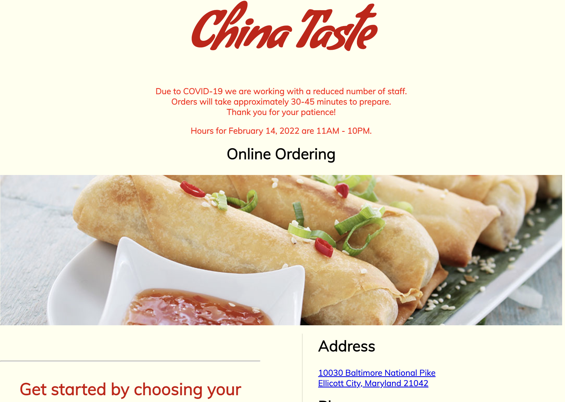
Research: Identifying Problems
Using Usability Concepts as a basis for critiques, I identified the following problems with the current interface:
Usability
Overall, the layout is quite unconventional:
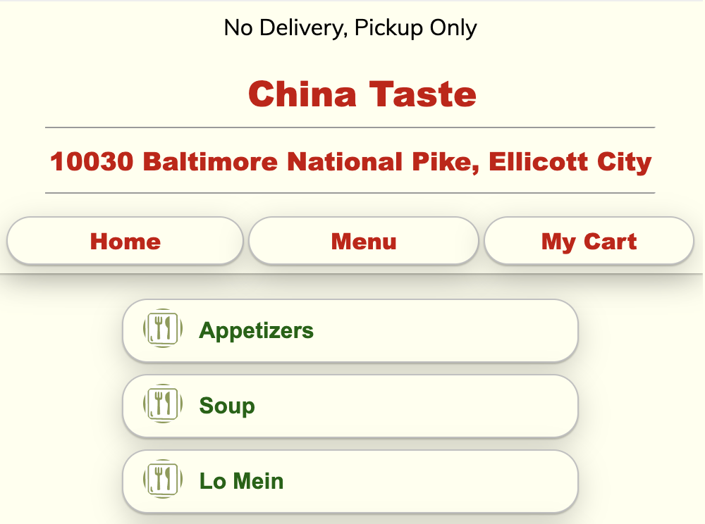
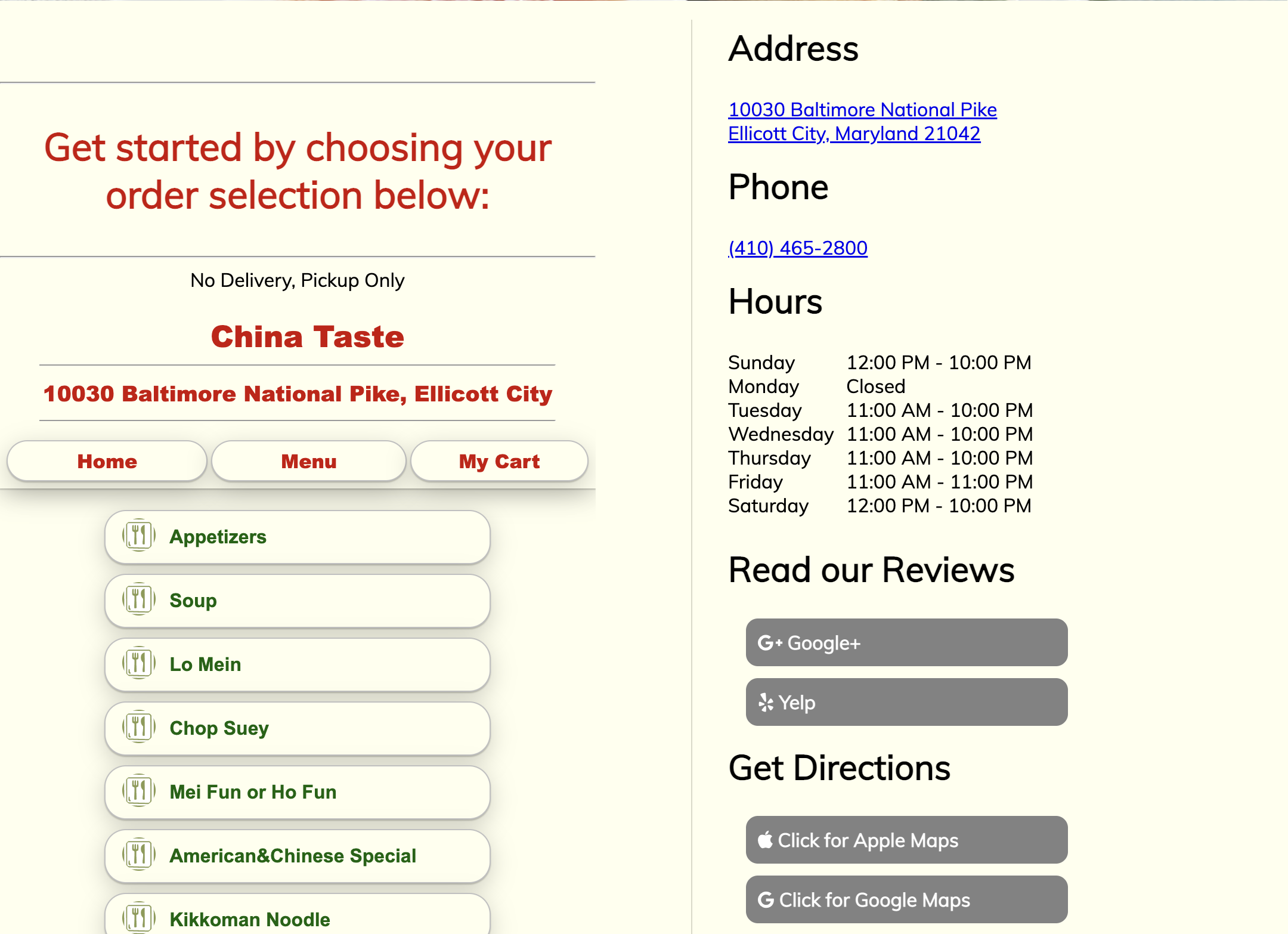
Learnability and Memorability
The menu interface requires relearning:
The key component that is unusable-and therefore confusing-is the menu/ordering interface. The other information/components are all unconventional, but very easy to learn.
Stakeholders
The main stakeholders are (1) new customers and (2) returning customers. Both groups, however, require the same key information to use the interface as intended: menu and ordering. As such, I focused on redesigning the ordering/menu interface.
Design Choices
Responsivenes
These low-fi wireframes outline how I made the interface responsive across desktop and mobile interfaces. In summary, I opted to use a collapsible navbar, along with flex wrapping to ensure that the mobile screen coudl fit all of the components featuredon the desktop.
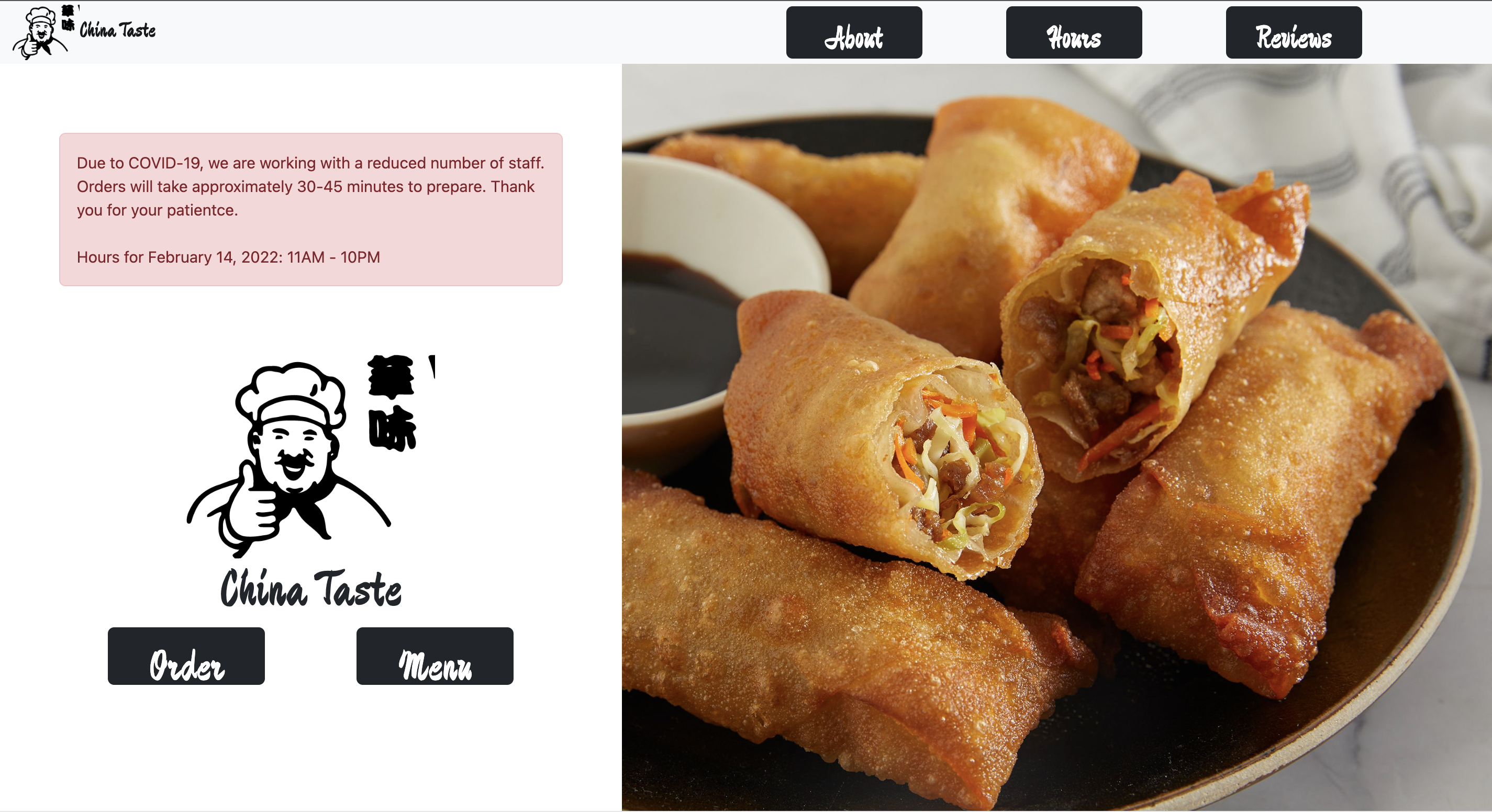
Usability and Layout Choices:
This is a snapshot of the final product
In executing this redesign, we were limited to one page, so I was unable to fully redesign the about, hours, and reviews pages. In addition, if I were to redesign the entire site, I would move the ordering interface to a completely different page to declutter the home page.
Conclusions:
I found this project to be especially challenging with it being my first time using Bootstrap. On the flip side, however, this project was extremely rewarding because it walked me through the entire design process from identifying problems, all the way to implementation. The most valuable lesson from this project was the reinforcement of good design principles; it was really interesting to actually critique poor design and improve upon it myself.